The First Day of 100 Days: Challenge Accepted

Developer from NYC. Current Tech Stack: React 👨🏽💻 SCSS 📜
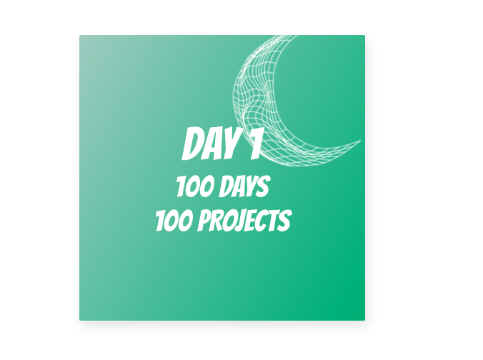
I created a Custom Build Number with Gradient. The main focus of this project was more on CSS, and the topic I dove into was linear gradients. I started by creating a custom build number, which I will be using for the duration of this project. I will document the challenges I encounter in my learning and the steps I take to get out of them. I will also write about what I learned and how it can help me expand my development knowledge beyond programming.
The Challenges
Personally, there were not too many challenges with this one, but I did take a deep dive into gradients. I set a goal for what I wanted to accomplish. The main challenge was selecting what color I wanted to use and implementing a gradient through CSS.
Learning Outcomes
What are gradients?
Gradients can be defined as a transition between two or more colors. Gradients can be represented by the data type. In CSS, 3 types of gradients can be used by their respective gradient built-in functions.
The 3 types of gradient functions used in CSS are:
- Linear-gradient()
- Radial-gradient()
- Conic-gradient()
Furthermore, you can create repeating gradients like the above functions by adding the word "repeating" to the functions' syntax. The parts can be used anywhere that an image would be used in, but I personally have only ever used them on backgrounds. For this project, I only used the linear-gradient function and will give a quick summary for its usage.
Linear-gradient()
Using the linear-gradient function was very straightforward. The linear-gradient function creates a gradient of colors split by a straight line. You need only two colors to create a gradient, but you can have as many as you want. You can also change the direction and use angles to customize how the gradient looks. Here is an example of the code that would be used to implement this function.
Creating the Project
The Setup
HTML
The HTML hierarchy is set up with 2 parental divs within the body tag. 1 div for the frame of the actual project and a parental div for the center to hold the paragraph tags. 1 paragraph tag for each line within the project.
I also included a moonlike SVG, symbolic of the many restless nights I might have? Is it too late to turn back…?
<div class="frame">
  <div class="center">
        <p class='p-1'>DAY 1</p>
        <p class='p-2'>100 DAYS</p>
        <p class='p-3'>100 PROJECTS</p>
        <img src="https://i.ibb.co/M6M5h9Z/18-Abstract-White-Lineart-Shapes.png" alt="18-Abstract-White-Lineart-Shapes" border="0">
  </div>
</div>
SCSS/CSS
I imported a font from google called Bangers by using the import function like so:
@import url('https://fonts.googleapis.com/css2?family=Bangers&display=swap');
And then used it within the .frame class by setting it within the font-family property.
.frame{
   font-family: 'Bangers', cursive;
}
My color gradient variables have been set using SCSS syntax, hence the $ symbol used, which is the syntax of variable usage.
$bg-gradient1: #ABD1C6;
$bg-gradient2: #2CB67D;
Most of the code used for the .frame class is to center the div. But I would like to emphasize the gradient implementation using the variables. The function was used on the background property. I placed it at a 120deg angle from light to dark to allow for a smooth transitioning.
.frame{
   font-family: 'Bangers', cursive;
   background: linear-gradient(120deg, $bg-gradient1,$bg-gradient2);
}
Furthermore, I removed the margin and padding on the paragraph tags to remove white-line spacing from the top and bottom of each paragraph tag.
.p-1,
.p-2,
.p-3{
   margin: 0;
   padding: 0;
}
HTML & SCSS/CSS Code + Project View
HTML Final Code
<div class="frame">
  <div class="center">
        <p class='p-1'>DAY 1</p>
        <p class='p-2'>100 DAYS</p>
        <p class='p-3'>100 PROJECTS</p>
        <img src="https://i.ibb.co/M6M5h9Z/18-Abstract-White-Lineart-Shapes.png" alt="18-Abstract-White-Lineart-Shapes" border="0">
  </div>
</div>
SCSS/CSS Final Code
@import url('https://fonts.googleapis.com/css2?family=Bangers&display=swap');

$bg-gradient1: #ABD1C6;
$bg-gradient2: #2CB67D;

.frame {
  position: absolute;
  top: 50%;
  left: 50%;
  width: 400px;
  height: 400px;
  margin-top: -200px;
  margin-left: -200px;
  border-radius: 2px;
    box-shadow: 4px 8px 16px 0 rgba(0,0,0,0.1);
    overflow: hidden;
  background: linear-gradient(120deg, $bg-gradient1,$bg-gradient2);
  color: #fff;
    font-family: 'Bangers', cursive;
    -webkit-font-smoothing: antialiased;
    -moz-osx-font-smoothing: grayscale;
}

.center {
  position: absolute;
  top: 50%;
  left: 50%;
  transform: translate(-50%,-50%);
}

img{
    width:200px;
    position:absolute;
    bottom:100px;
    left:100px;
}


.p-1,
.p-2,
.p-3{
    text-align:center;
     margin: 0;
   padding: 0;
}

.p-1{
        font-size: 64px;

}

.p-2,
.p-3{
        font-size: 42px;
}
Project Preview

Takeaway:
My goal is to build 100 projects in 100 days and start a career as a developer. I hope this article can help anybody understand the use of gradients within CSS. A shout out to 100dayscss for this specific challenge and its intro source code. If there are any questions, feel free to reach out on Twitter @jfusecodes.


